
Netflix Prize: Feature Error Curve
A major development towards achieving the goal of the Netflix Prize was the discovery that a recently divised sparse matrix factorization method was well suited to and performed competitively on the prize task. For more info see:
- Netflix Challenge (October 27, 2006)
- Netflix Update: Don't Try This at Home (November 02, 2006)
- Netflix Update: Try This at Home (December 11, 2006)
- Generalized Hebbian Algorithm for Incremental Singular Value Decomposition in Natural Language Processing, Genevieve Gorrell, Department of Computer and Information Science, Linkoping University.
- Generalized Hebbian Algorithm for Incremental Latent Semantic Analysis, Genevieve Gorrell and Brandyn Webb.
So we have an N x M sparse matrix of ratings (users x movies) and two factored out vectors, a user vector of length N and a movie vector of length M. Following factorization we may also chose to maintain a sparse matrix of rating residuals, this represents the portion of each rating not accounted for by the two factored out vectors. That is, we can multiply the two vectors, add the resulting matrix to the residuals matrix and we have reconstructed the original ratings matrix.
The residuals matrix allows us to put the two vectors aside and re-apply factorization to the residuals matrix. Repeating this process yields multiple user and movie vector pairs and a residuals matrix which slowly 'erodes' down as the most prominent 'features' are factored out of the data (as as side note the number of vector pairs that are factored out is referred to as the rank of the factorization, that is, rank N factorization yields N vector pairs).
From Simon Funk...
The end result of SVD is essentially a list of inferred categories, sorted by relevance. Each category in turn is expressed simply by how well each user and movie belong (or anti-belong) to the category. So, for instance, a category might represent action movies, with movies with a lot of action at the top, and slow movies at the bottom, and correspondingly users who like action movies at the top, and those who prefer slow movies at the bottom. It's completely symmetric in the sense that you could just as well call it the slow movie category and reverse the lists.
The actual categories it discovers are... whatever the data implies. The algorithm has no inherent concept of action, and doesn't even get to see the movie titles let alone any details about the movie itself. All it gets is a hundred million examples of: user 17538 gives movie 4819 a rating of 3. So it's interesting to see what it comes up with.
We refer to the inferred categories as 'features' of the data. The most prominent features are factored out first (the features that have the greatest ability to explain the variance in the remaining residual ratings). It's also worth noting that there's a circularity in how the features are defined and discovered, that is, a feature is defined by the degree to which each user and movie is in that feature (there is nothing of a more concrete nature to refer back to), while at the same time each user and movie's single factorization value represents how much the user and movie are in that feature. This circularity is perhaps the trickiest part of the method for the uninitiated to 'get their head around', hence a certain amount of incredulity can be expected when trying to explain this method to a general audience. People in everyday life tend to think in strict hierarchies, C derives from B derives from A.
Each feature then is represented by the degree to which each user and movie is in that feature, that is, the user and movie vector pair, there is not a more compact representation than this. If we multiply the two vectors we get a matrix that contains the portion of the known ratings that have been represented by the feature, and for all of the unknown ratings we get a prediction for that rating based on that feature. We can get increasingly better predictions (up to a limit) by summing the predictions from each successive feature.
Feature Error Curve
If we multiply the vector pair to get predictions a very noticeable type of error is observed in the predictions, very simply, the predictions for low ratings tend to be too low and the predictions for high ratings tend to be too high. We can see this by looking at the predictions made for known ratings and plotting a curve of predicted ratings versus the known ratings that were being predicted. Here we make the error clearer by plotting predicted rating versus error/distance from known rating being predicted.
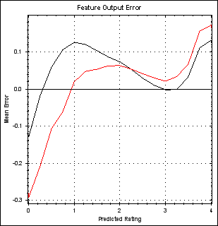
The two lines come about because the ratings have been split into two sets, one training set and one 'probe' set that is not trained against (and which therefore is not subject to over-fitting). The two data sets each have their own error curve, black is the training data curve and red the probe data curve. The obvious way of using this knowledge to improve predictions is simply to adjust each rating to correct for the error based on the above plot. E.g. apply the transformation described in this plot (where we flip the error sign and add it to the line y=x).
Moreover, the curves suggest non-linearities in the data that are not represented by our linear factorization of the data. Perhaps a cleverer factorization that takes into account the known curve shape (or discovers it automatically) is required? Note however that each feature has a distinct error curve, and that the curve diminishes in overall magnitude/prominence for each successive feature (but they tend to have the same recognisable shape) if previous features correct for their error curve.
In fact after 20 or so features the error curve becomes flat (apart from some noise). However, if you plot the curve after a further 20 features or so of not correcting feature error then a curve begins to re-emerge. This re-emergence is, I assume, the result of the accumulation of many faint curves, individually they are lost in the background noise but together they become prominent again. On this basis I chose to apply the curve for the first 20 features and then again every 20. Perhaps I should just keep applying a curve at each feature?
Colin,
(some time in 2008)
 Copyright 2008-2016 Colin Green.
This article is licensed under a Creative Commons Attribution 3.0 License